12 Landing Page Best Practices You Need To Follow
Creating a high converting landing page that beats all your competition in the market is certainly no walk in the park. There are thousands of things that need to be kept in mind while crafting it. The science of psychology, what your customers want, what you want, what results you are seeking and a lot more. That’s why you should be following some of the landing page best practices.
So what does it really take to create landing pages that convert like magic for your business? Knowing that there is no such thing as ‘one size fits all’. There is absolutely no standard step-by-step manual to create a perfect landing page.
Every landing page is different
Each landing page has a different purpose, based on what their business or marketing campaign goals are.
They also have different call to actions (goals) for different audiences to cater to. No two businesses can have the exact same purpose, intent, product, pricing, messaging, value proposition or even a testimonial approach.
But since they are all landing pages, there are some elements that characterize a highly converting landing page. After trying and testing various elements on landing pages, there are top 12 elements that we found the best:
Element 1: A Catchy Headline
The headline is the first thing a visitor sees. It is the point where it all begins. From grabbing attention, generating interest to creating a general understanding of the business. While crafting a high converting landing page, here’s what you need to keep in mind:
* The headline must grab the reader’s attention in less than 5 seconds.
* The headline should inform the reader what the product/service is about.
* The headline should be as clear, concise and crisp as possible (ideally no more than 15 words).
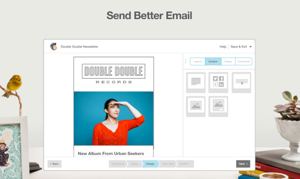
For example: MailChimp uses a pretty direct headline, ‘Send better email’ – that resonates with its target audience instantly. Three words and the visitor knows what they are about, their value proposition and it definitely does capture their attention!
Element 2: Reinforcing Sub-headlines
A headline can capture the user’s attention, but it is the sub-headline that makes them stay. Here’s everything you need to keep in mind while creating a sub-headline:
* The sub-headline must reinforce what the headline says in a persuasive manner.
* The sub-headline must be slightly more in-depth than the headline.
* If you’re stating a problem in the headline, make sure the sub-headline offers a solution.
* The sub-headline is generally placed right below the main headline.
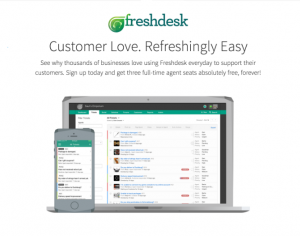
For example: Freshdesk supports its headline with a sub-headline that reassures the user of the technology by stating that a number of people are using it and assuring its ease of use.
Element 3: Eye-catching Visuals
About 65% of people are visual learners and 90% of the information in our brain is stored in the form of visual data. Hence, visuals play a large role in the way a visitor consumes your landing page copy. Here are a few things to keep in mind while choosing visuals to create landing pages that convert:
* Use oversized images as they are both aesthetically pleasing and boost conversion rates.
* Ensure the visuals are relevant to your business, product or service.
* The images used on the landing page must be of high quality and resolution.
For example: Shutterstock itself makes use of a large, prominent picture on its landing page – it is relevant to what they offer and aesthetically maintains their marketing message.

Element 4: Justification
You now have their attention and have convinced them to stay. What’s next should be an explanation to why and what they are there for. If a user doesn’t understand your product or service, they are as good as lost. The best way to avoid losing them, is to be absolutely straightforward about what you offer.
Here are a few landing page best practices to craft an explanation:
* Spin it around the headline.
* Combine multiple elements like headline, sub-headline, image and separate paragraphs that explains further.
* The explanation must be made to sell, but should also be oriented towards stating the user’s benefit
Element 5: Value Proposition
A value proposition is a promise of quality to be delivered and acknowledged, and a belief from the customer that the business will deliver a good experience on interaction. This element basically answers what is typically the user’s first question when visiting a landing page – ‘what’s in it for me?’
Here are a few things to keep in mind while creating a value proposition:
* It should be focused around the user.
* It should list down the benefits that the user will get from your products and services.
For example: Crazy Egg simply lists down what the user can do with their technology and how it benefits them in the long run.

Element 6: Logical Flow
You could have the highest quality content on your landing page and still lose prospects simply because the structure of your landing page is all over the place and your visitors couldn’t make any sense of it. Having a logical flow to your content keeps your visitor cognitively engaged and offers them a step-by-step process to follow till conversion.
Here are a few things to keep in mind when creating a flow for a high converting landing page:
* Start with an explanation that lets the user know why they are there and then move on to listing the benefits. Follow this up with trust builders such as testimonials and then conclude it with your CTA.
* Your placement of the CTA substantially influences the flow of the landing page. You can use multiple CTAs on a landing page – try positioning one at the end and some in-between the content in a discrete manner. If you want to encourage multiple actions through your landing page campaign with easy to implement CTAs, you can make use of tools like SalesPanda or Marketo.
* You can use design to demarcate your content sections on the landing page. Doing so not only raises it’s visual appeal, but also the readability.
* Test the length of the landing page – while shorter ones are known to work for a few businesses, long-form landing pages are generally more effective for persuasion.
Element 7: Address Pain Points
Here’s a human psychology fact that you should take into account for almost every marketing campaign – humans are wired to seek for the easiest ways to accomplish things. Discover the common pain points and the solutions you can provide with your products/services.
Here are a few landing page best practices to keep in mind while addressing the pain points of your audience:
* Mention what’s at stake along with what they will gain.
* Include pain points and solutions you gave in customer testimonials.
* Remember to directly address the problem and provide a solution.
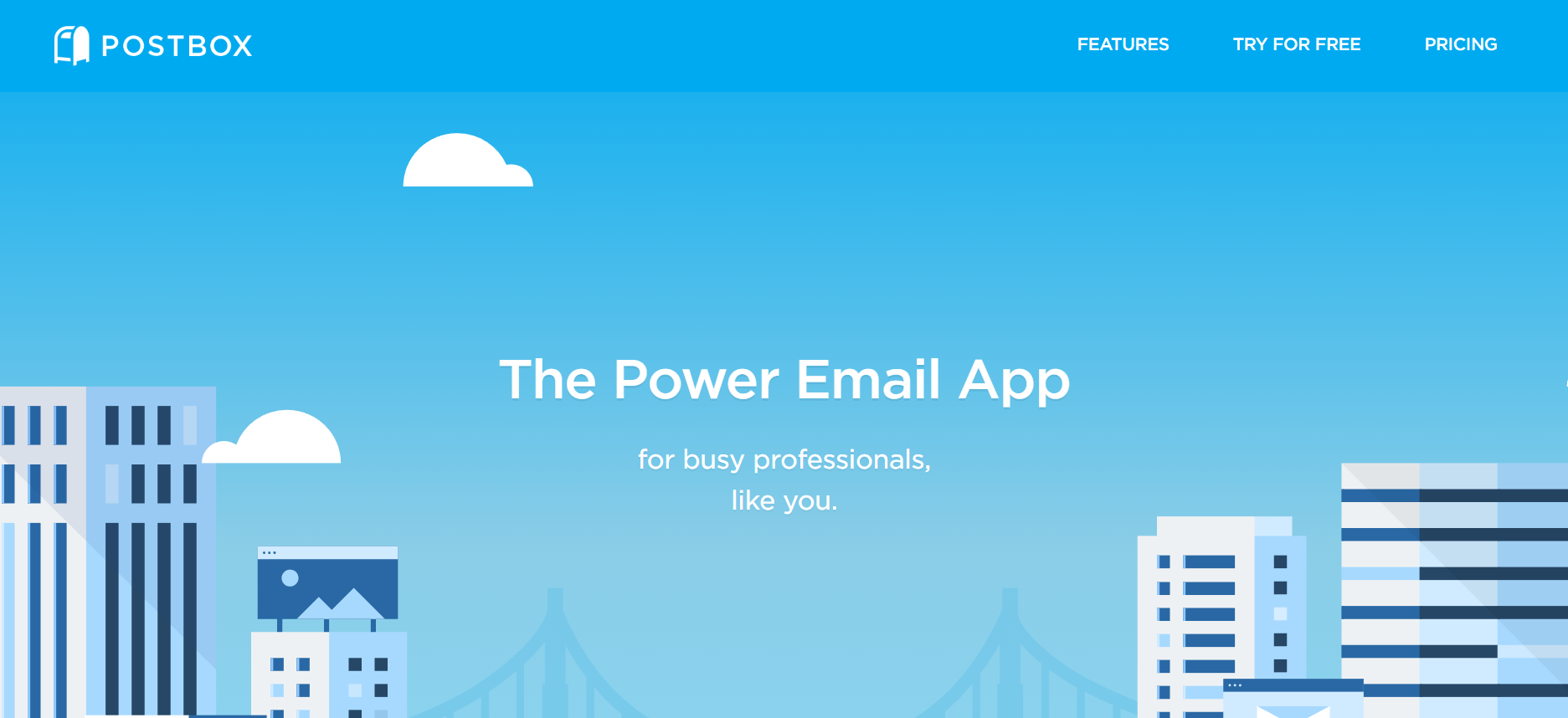
For example: Postbox uses the pain point of its target audience as the headline and directly mentions itself as a solution for the same.
Element 8: Pleasure
Just as we naturally seek to avoid pain, we also continually look for things that make us happy. Even when interacting with a business or a brand, we try to derive the element of pleasure from it. Here are a few things to keep in mind to efficiently utilize this element on landing pages that convert:
* Don’t just resolve the pain points previously mentioned, include emotional pleasure cues in it.
* One of the goals of your landing page should be to show how customer can derive pleasure from buying your products/services.
* Using both emotional and psychological pleasure will allow you to create a very compelling copy.
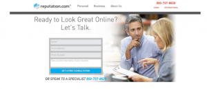
For example: Reputation.com adds the element of pleasure and their value proposition right in their headline. So the visitor knows exactly what they are about, what they will gain and which pain point they are addressing with their services.
Element 9: Trust Builders
All persuasion is pointless if you don’t have trust builders on your landing page. To convince a visitor to interact with your business, it is important to let them know that there are others who have been using your product or service and are happy with it. It is also a great way to establish credibility. Here are a few tips on implementing trust builders on your landing page:
* Include customer testimonials from everyday people, and not just influencers or experts.
* Use pictures to give an identity to the people who give you reviews. Include their professional positions as well if possible. Doing so allows the visitors to draw parallels to the reviewers.
* Include real numbers and data from your business insights that assure the delivery of the promises you make on your landing page.
* Showcase popular brands that are using your product or service. Logos of famous brands are eye catching, easily recognizable and help greatly in building credibility.
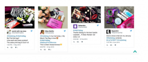
* Include a live social feed that displays what your customers are saying about you on social media. This showcases your openness and confidence in your product/service.
For example: Fab Bag has included a live Twitter feed on their landing page, that shows what their customers are saying about them.
 Element 10: Contact Information
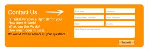
A good way to prove to your customers that you care and showcase your commitment to supporting them is to include your contact information on the landing page. It is important to let your audience know that you’re always within reach via multiple means – phone numbers, email addresses, a physical address, social profiles and contact forms, or even live chat.
For example: Tasks EveryDay has a simple contact form for people who want to know more about their product and aren’t sure how they can integrate it into their daily processes.
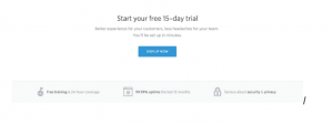
Element 11: Guarantees
A guarantee – irrespective of what it is, helps reassure people about interacting with your business. Providing a guarantee on the landing page improves the likelihood of a conversion. Some of the most oft-used guarantees promised by businesses across different industries include promises of satisfaction, money back guarantees, an anti-spam policies, promises that add more value to the USP, etc.
Positioning your guarantee close to your call-to-action can serve as the final persuasive nudge to convert a prospect into a customer.
For example: Help Scout places its guarantee of free training, 99.99% uptime and security policies right below their call-to-action, to reassure their visitor about choosing them.
Element 12: Call-to-Actions
The last and probably the most important element of all, is the call-to-action. If there is no follow up action despite all the talk on your landing page, all your efforts are neither going to add value to your goals nor address the visitor’s pain points. The visitor must be guided to taking an action that resolves their problem while working for you as well. Here are a few landing page best practices you need to keep in mind when crafting a CTA:
* Use a compelling copy and ditch the boring ‘click here’ buttons.
* Make the button larger in size compared to the other elements.
* Use a contrasting color from your website’s theme to draw attention (but remember to not make it look too out of place).
For example: SalesPanda uses an orange call-to-action button that says, ‘Show me live’ – the copy not just suggests a unique action, but also compliments both the headline and the explanation, while also standing out from the rest of the design.
 Over to you
If you manage to nail these twelve elements, we’re certain your landing page will already be head and shoulders above the majority of your competition.
Is there an element that we missed that you think belongs on a landing page? Enlighten us by dropping your suggestions in the box below!